Everybody has heard about the latest cool thing™, which is DALL·E 2 (henceforth called Dall-e). A few months ago, when the first previews started, it was basically everywhere. Now, a few weeks ago, the floodgates have been opened and lots of people on the waitlist got access - that group included me.
I’ve spent a day playing around with it, learned some basics (like the fact that adding “artstation” to the end of your phrase automatically makes the output much better…), and generated a bunch of (even a few nice-looking) images. In other words, I was already a bit warmed up.
To add some more background, OctoSQL - an open source project I’m developing - is a CLI query tool that let’s you query multiple databases and file formats in a single SQL query. I knew for a while already that its logo should be updated, and with Dall-e arriving, I could combine the fun with the practical.
In practice, you’ll see that the process looks a bit like the Westworld depiction of writers creating storylines in season 4 (no worries, this is not a spoiler, but I do recommend the series if you haven’t watched it).
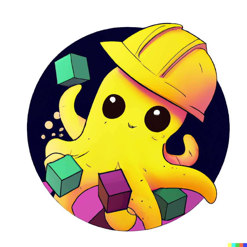
So TLDR, here’s the logo I finally ended up with:

In the rest of this post you’ll see where I started, what I went through, what I learned along the way, and how it slowly evolved into the finally chosen image. I will only show the mostly happy path here. I will also only show images that were fairly ok (discarding the other 70+% that were terrible).
But first, let’s quickly describe how DALL·E 2 works. You get a bunch of free credits and you can buy more. A single credit enables you to do one of the following:
- Generate: Generate 4 images for a given phrase.
- Edit: Generate 3 images for a given phrase and original image with regions marked as transparent (either using image editing software, or using a built-in transparency drawing tool).
- Variations: Generate 3 variations based on the given image, but without providing a phrase. This means you unfortunately can’t do stuff like “give me the same entity as on the picture, but doing xyz”, unless it can be achieved by marking a region as transparent for point 2.
Generating the Logo
I had a fairly specific (I thought. I was wrong though, or at least I couldn’t describe it in words well enough) idea for the logo. The name OctoSQL stems from octopus and SQL, with the idea being that an octopus has many arms and can manipulate many entities at the same time, like OctoSQL can operate on many datasources simultaneously.
So what I originally wanted to achieve was a cartoonish cute octopus juggling a bunch of databases (or entities representing databases, I decided not to use actual logos of databases).
Well then, let’s start with a fairly straightforward phrase. You can see I’m using some “direction-setting” suffix keywords right away.
A baby octopus juggling diagrams of databases, digital art, cartoon, drawing

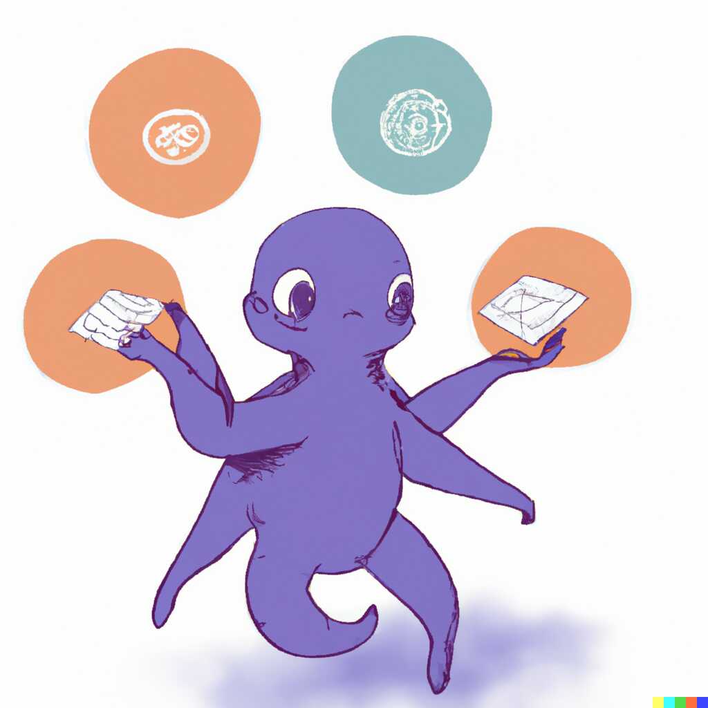
That first one actually looks quite cool. Let’s do a few variations around it.

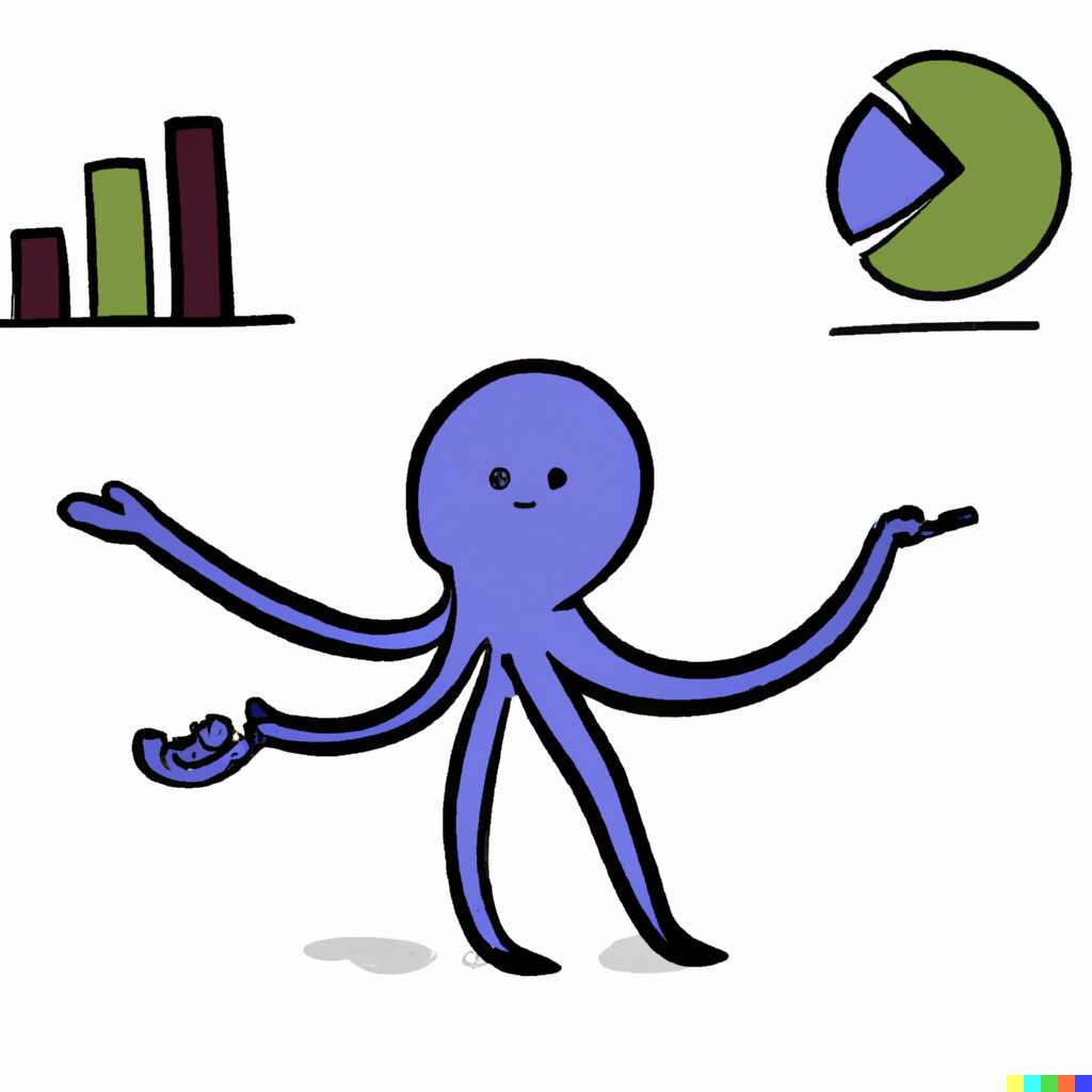
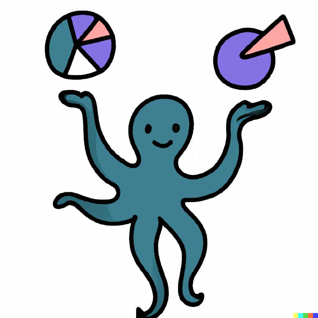
Nice! It does look cartoonish, even if I would prefer them to have a bit more depth. However, the main issue is that these octopi (the quite beautiful plural form of “octopus”) are holding charts. OctoSQL doesn’t deal with charts, it deals with data. This could give a false promise about what is possible with OctoSQL.
Back to the drawing - or shall I say, phrasing - board, then. Let’s add some abstract shapes for the octopus to hold.
A baby octopus juggling diagrams of databases, arm wrapped around one cube, digital art, cartoon, drawing
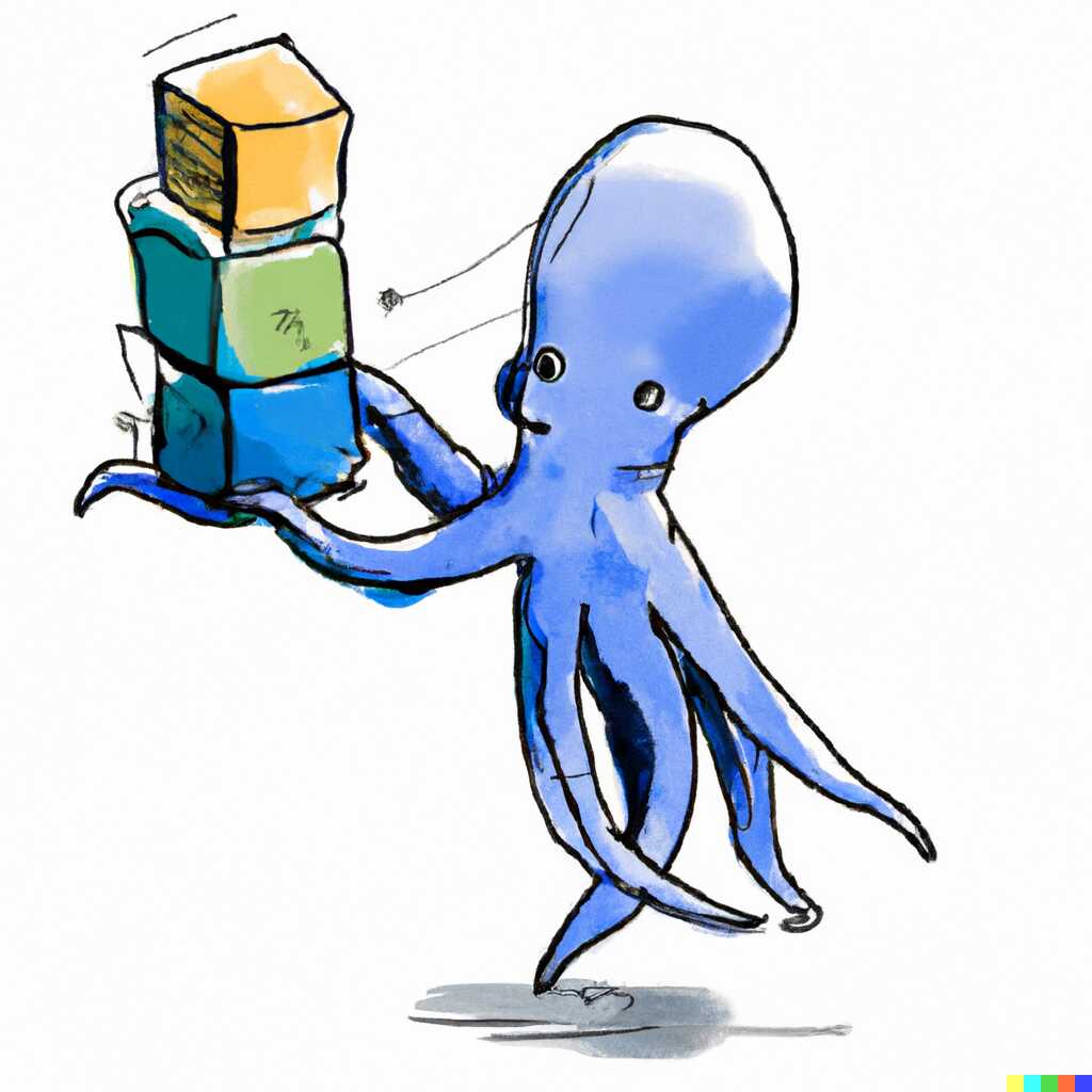
That looks quite cool, not what I want really, but quite cool nonetheless. But maybe we can experiment with drawing styles?
A baby octopus juggling 3d shapes representing databases, arm wrapped around one cube, streams of data passing through the cubes, digital art, cartoon, drawing, logo, simple shapes
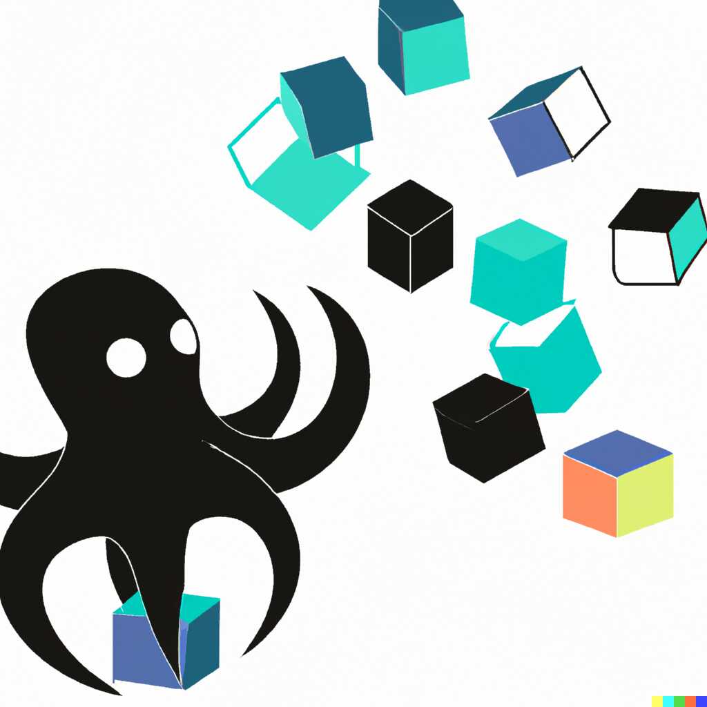
Simple shapes disqualified.
Let’s try a few more.


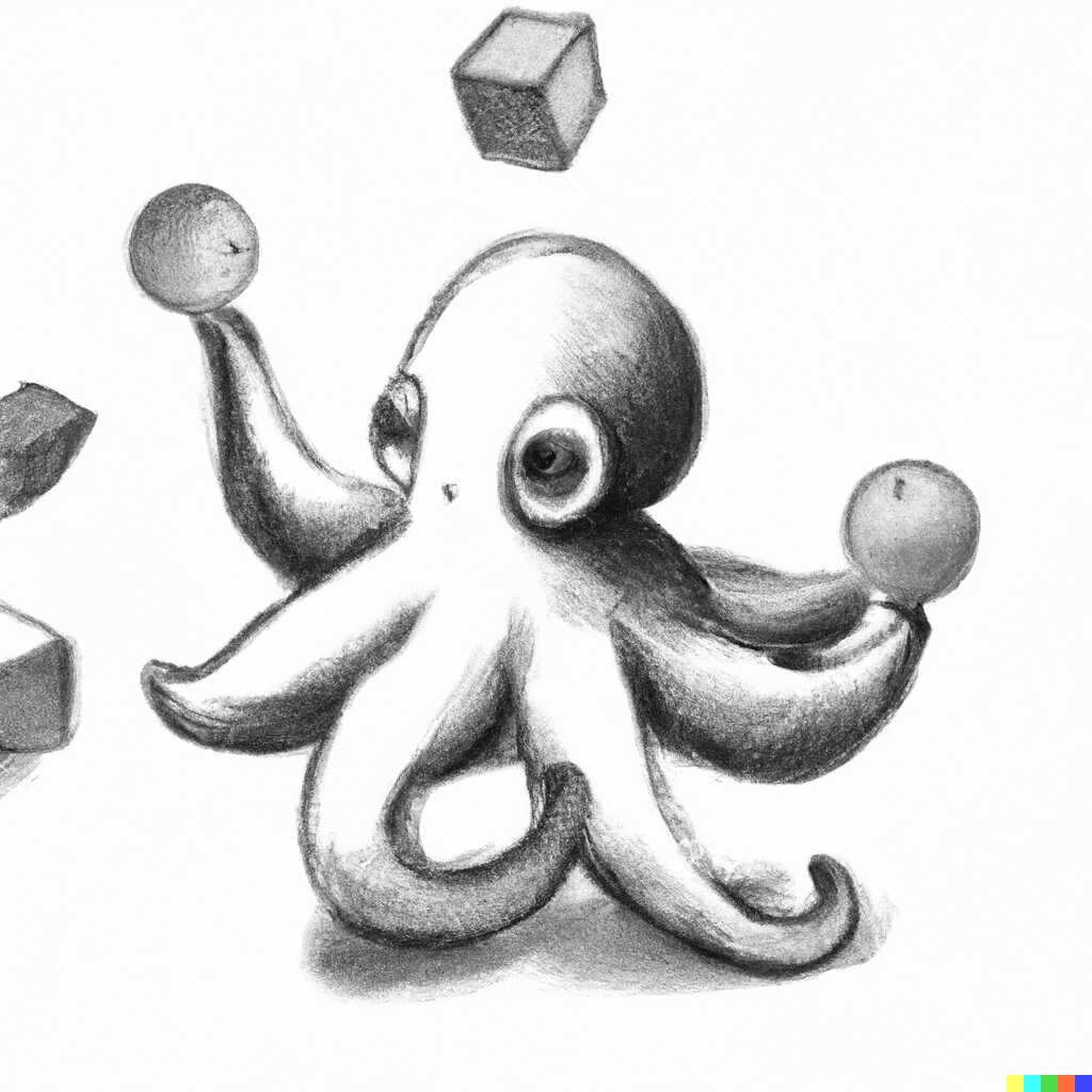
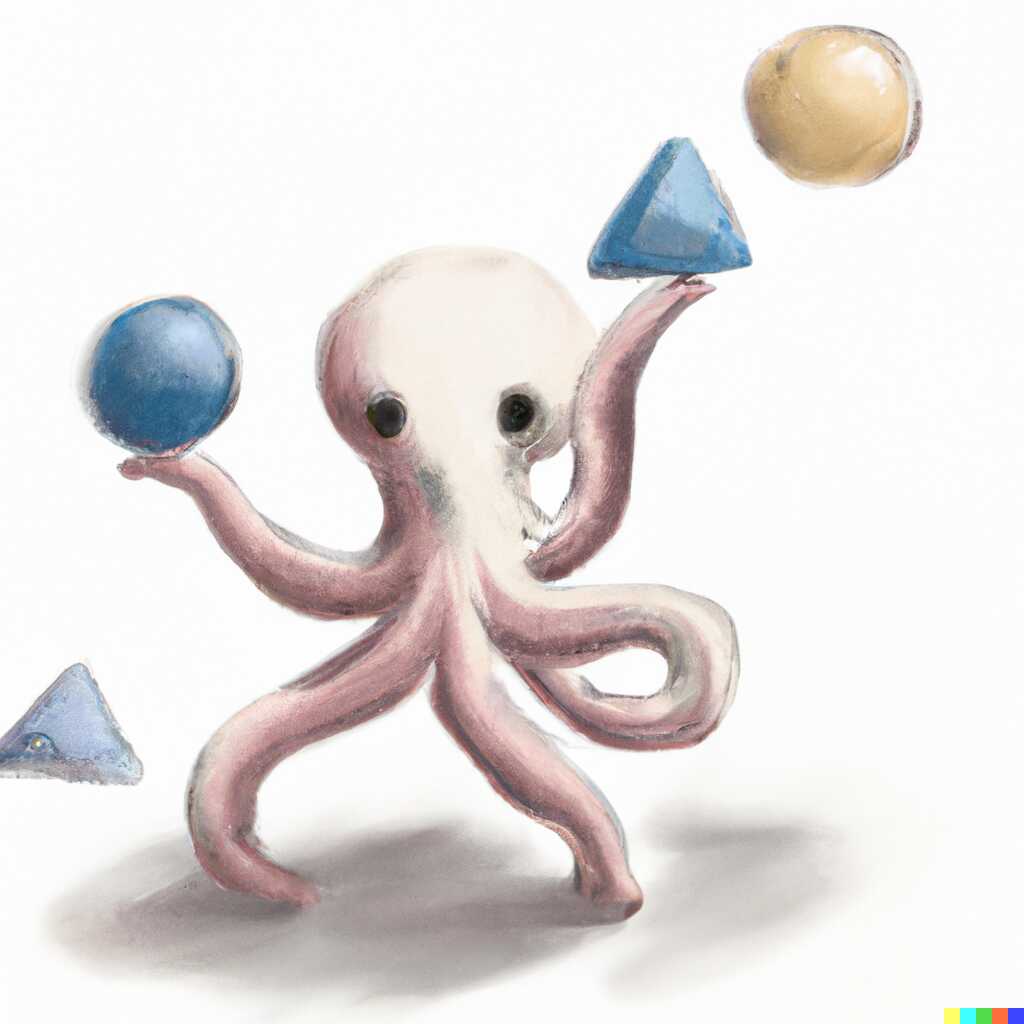
Ok, maybe we can go back to the original approach, but simplify? Let’s use shapes instead of databases and maybe add some quality-improving tags.
A baby octopus juggling 3d shapes like cubes and spheres, digital art, cartoon, artstation

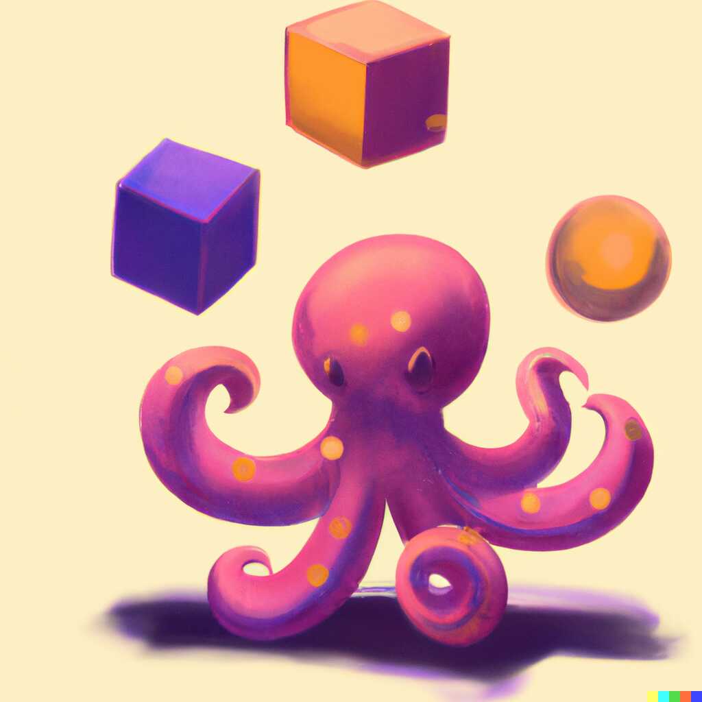
Quality-wise? Not bad. As a logo? Not really.
Let’s try pencil sketches one more time.
A baby octopus playing with diagrams of databases, data records, and 3d shapes like cubes and spheres, digital art, cartoon, drawing, pencil sketch
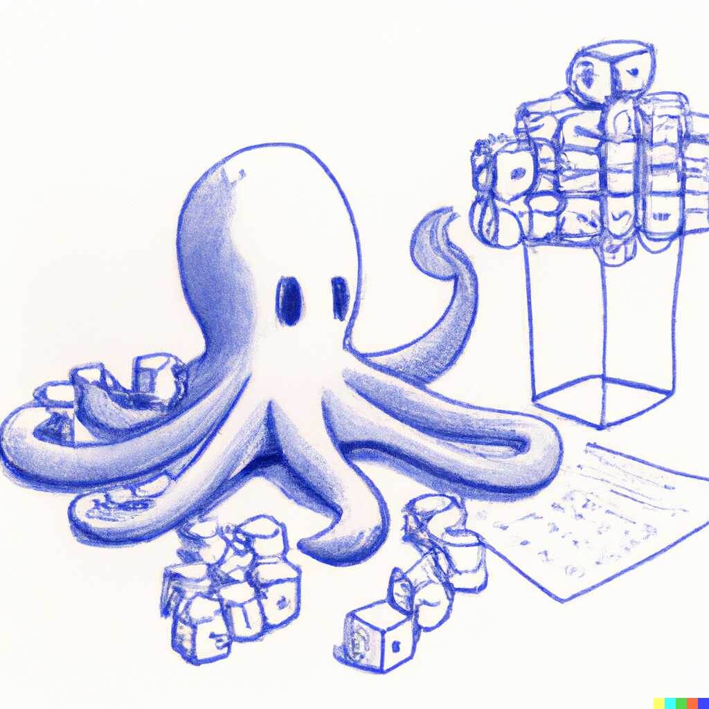
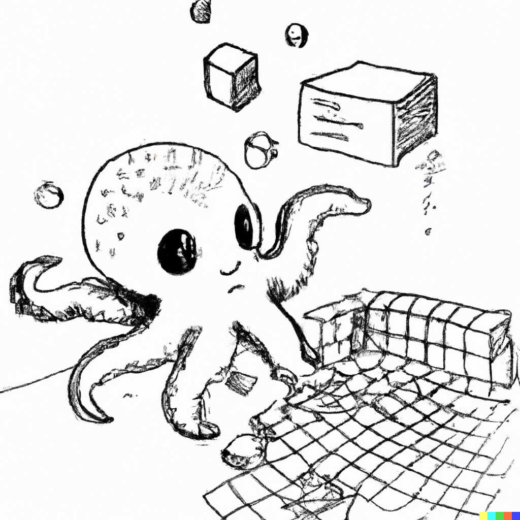
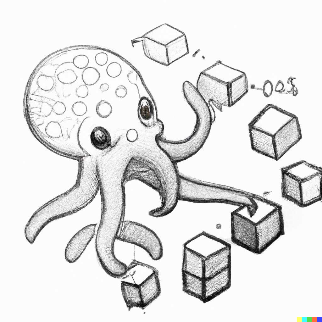
That looks nice! But variations didn’t yield anything breathtaking.
How about we try to use something even more abstract? Like streams of data? And add “logo”?
Baby octopus playing with streams of data, logo, digital art, drawing
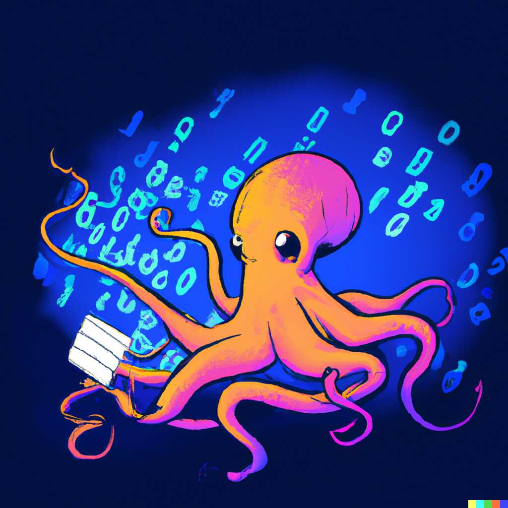

That was worth it just for the fun of it. But it’s not really usable. Maybe I’m asking for too much? Let’s do a simple octopus, without the data bit.
Baby octopus, logo, digital art, drawing
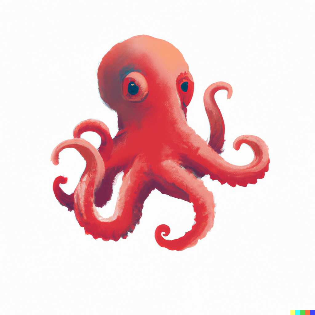

Those do have their charm! Let’s try to edit them and add some stuff into their arms! Like data streams, data records, 3d shapes, and - the name of which I just learned, but which we’ve all seen in all kinds of diagrams - blue data storage cylinders.
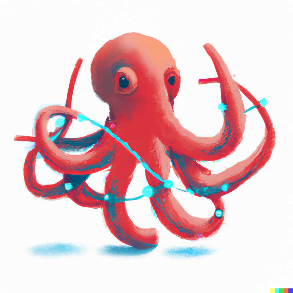


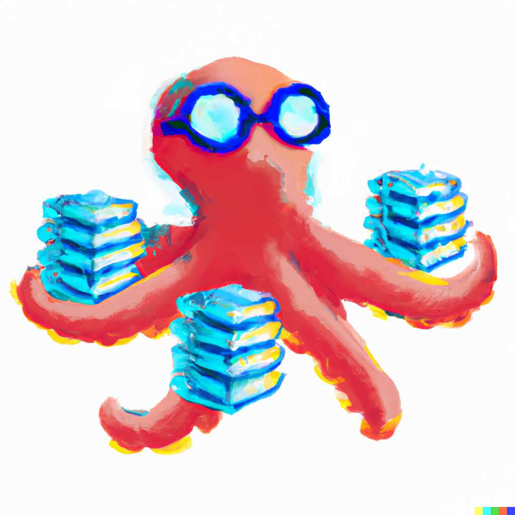
Each time I’ve marked a part of the image to be replaced and let Dall-e do its thing.
Those were fine, but I decided to do another try without the bells and whistles, but with the “logo” tag.
Baby octopus, logo, digital art, drawing
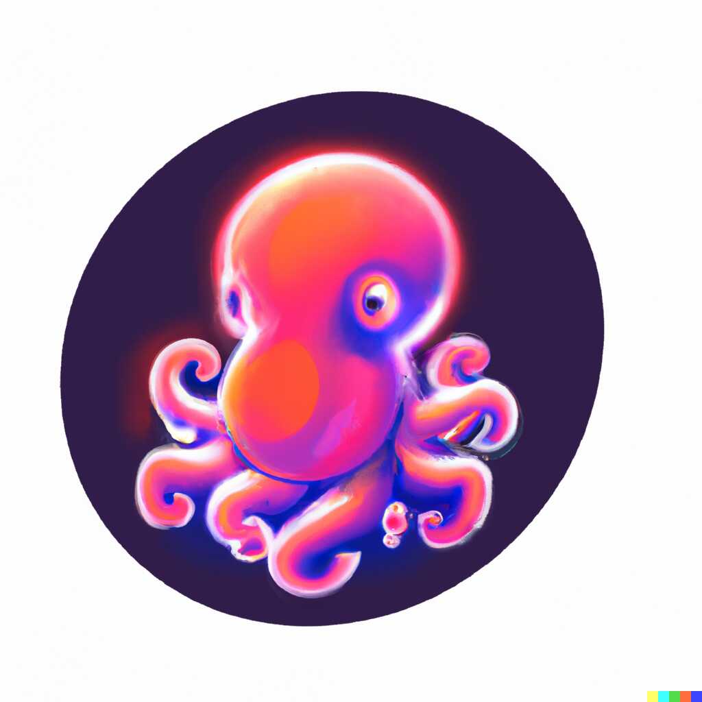
And this one actually led to an epiphany! Logos will often have a background. This dark background circle was what I needed. It will also force Dall-e to mostly stay in the confines of it (and not draw on the whole available space).
Trying a basic phrase we already get some nice logos!
Baby octopus, logo, digital art, drawing, in a dark circle as the background
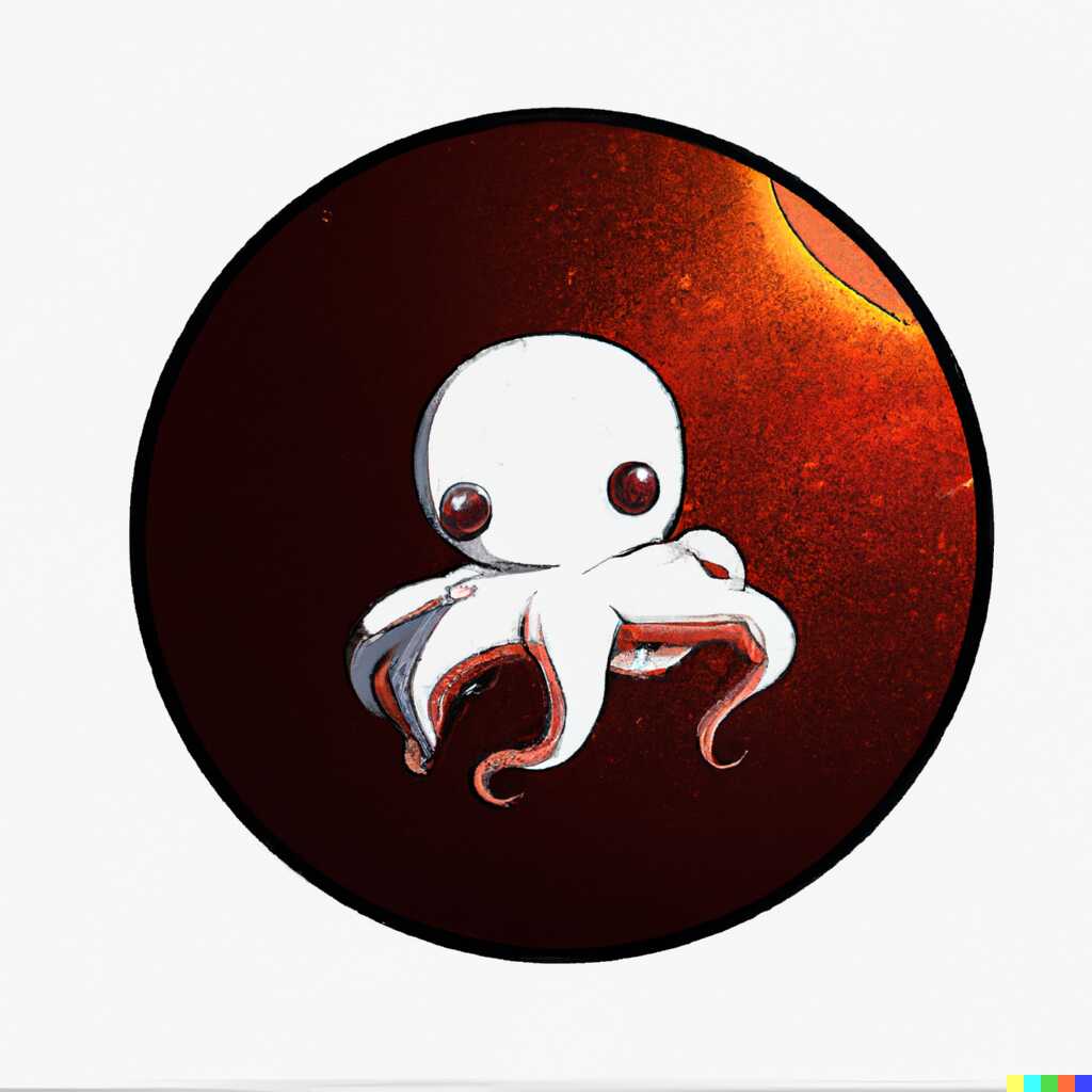
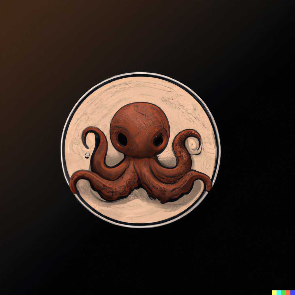
… and they’re nicely confined to a space in the center, which is very useful for a logo.
Now maybe we can try to add some entities for the octopus to play with.
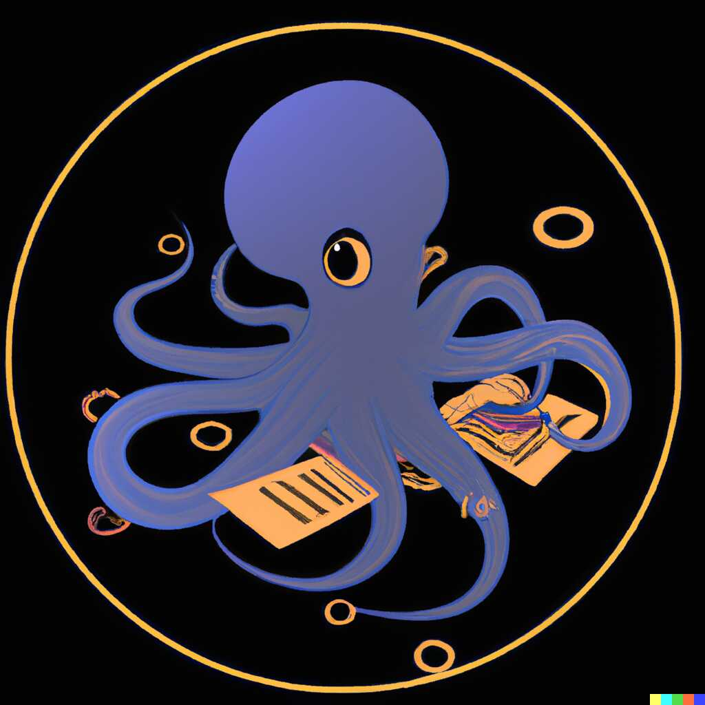
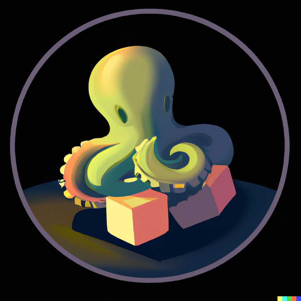
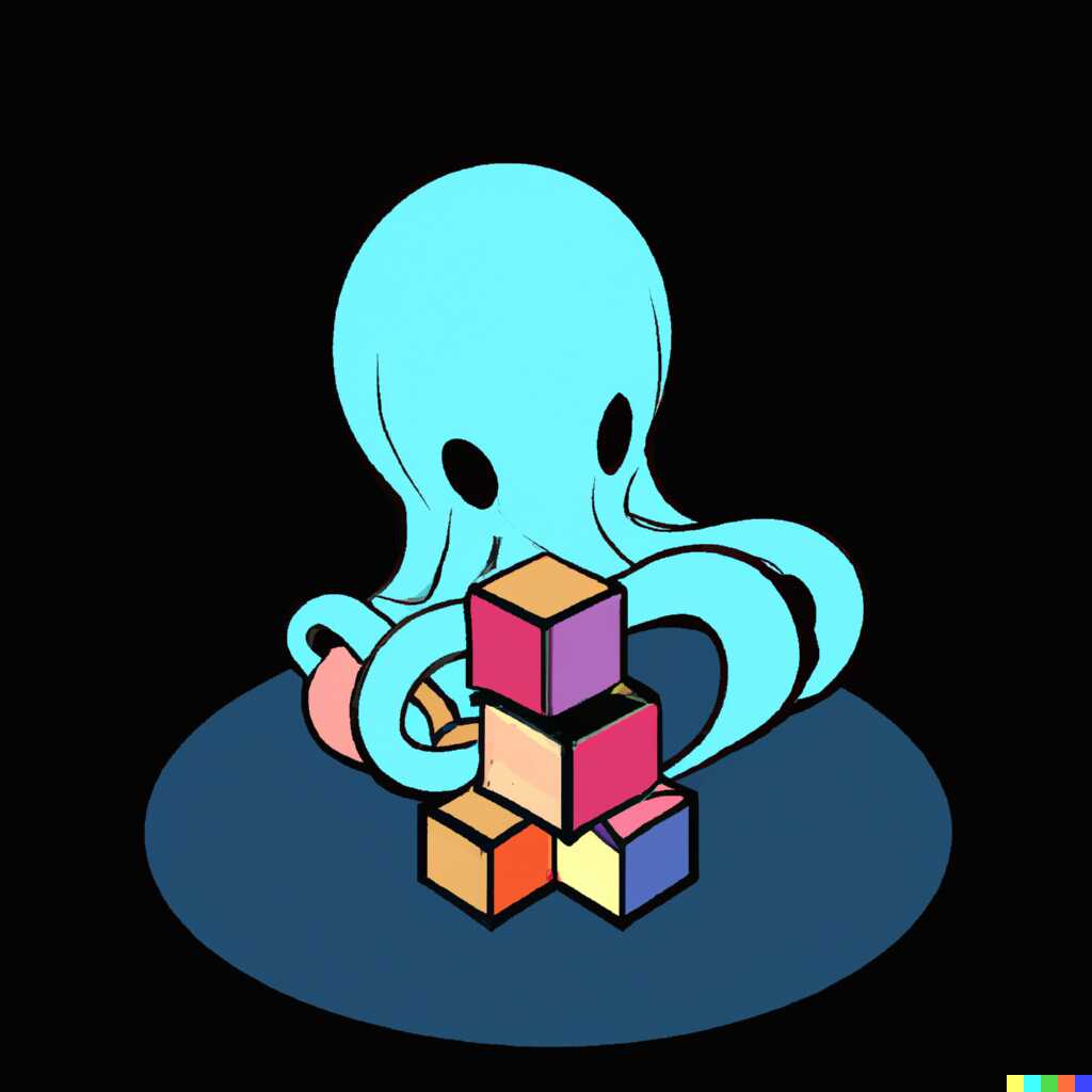
But those are a bunch of dangerously-looking octopi. I used “baby” to get something a tad more adorable.
So lets try to turn up the cuteness factor:
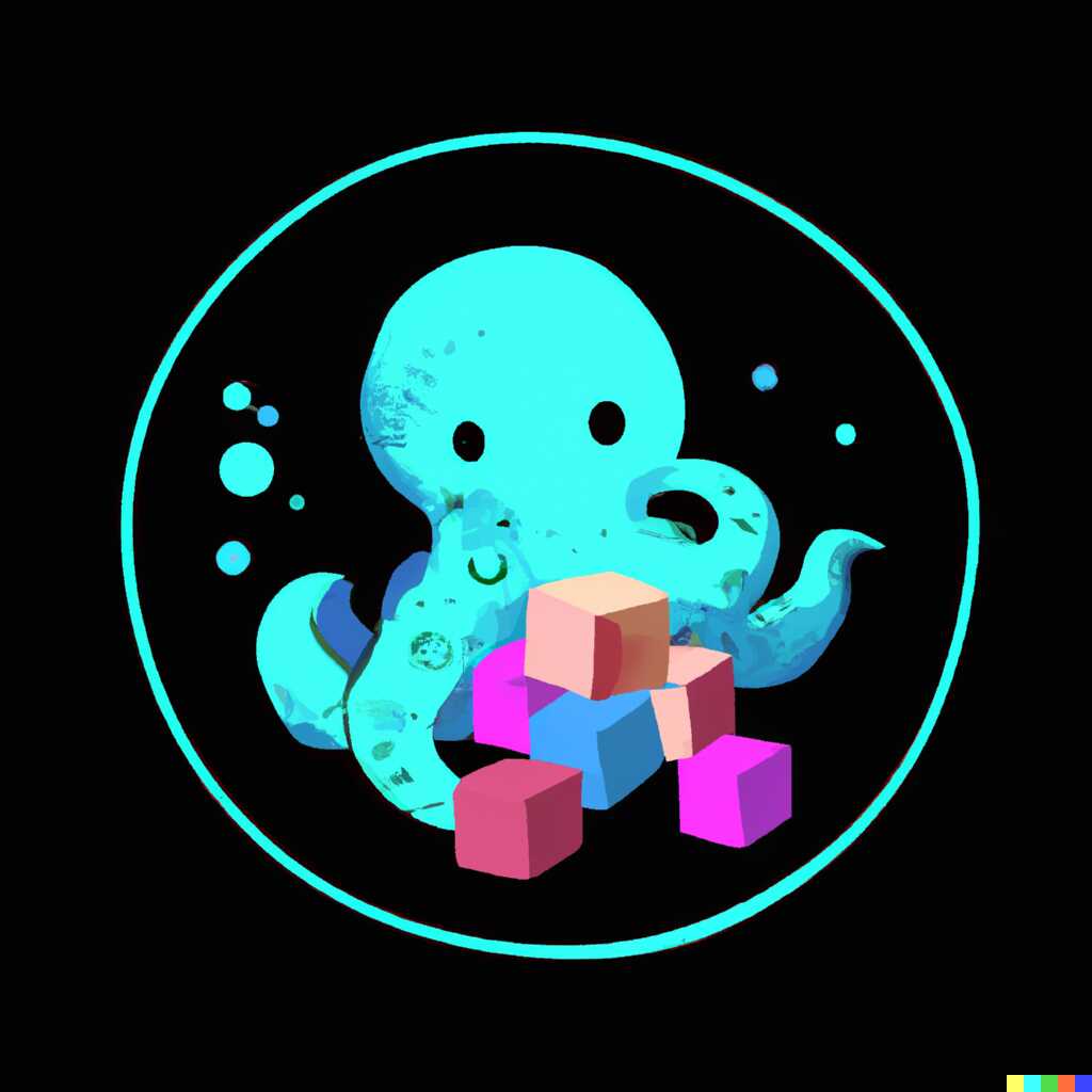
Cute baby octopus playing with cubes, logo, digital art, drawing, in a dark circle as the background

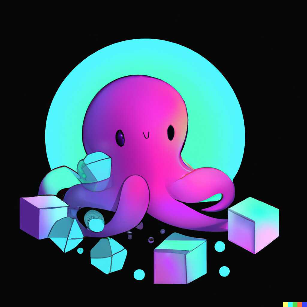

Much better! Could we add even more of it? Why, yes!
Cute baby octopus playing with cubes, logo, digital art, drawing, in a dark circle as the background, vibrant, cheerful, bubbles
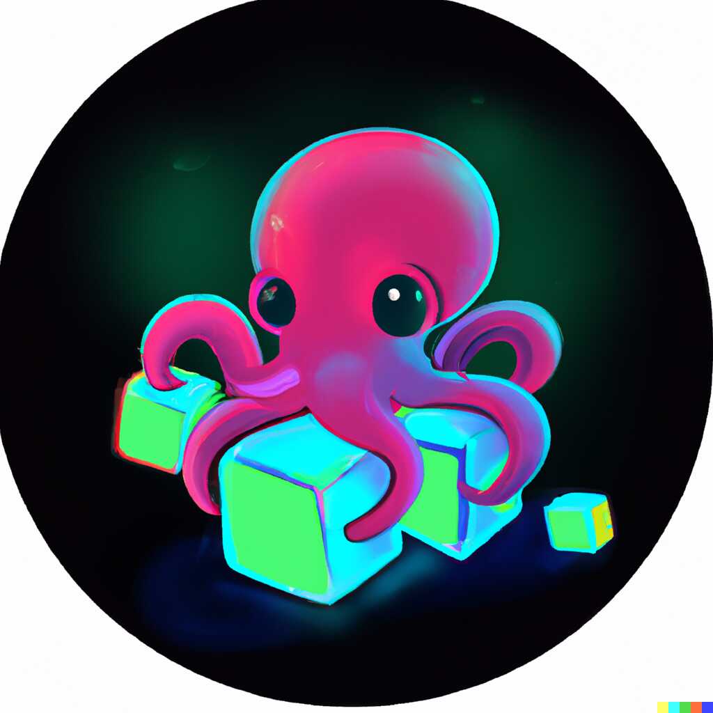
Doing a chain of variations based on it, I got one nice octopus, one psycho, and a bunch of app icons.
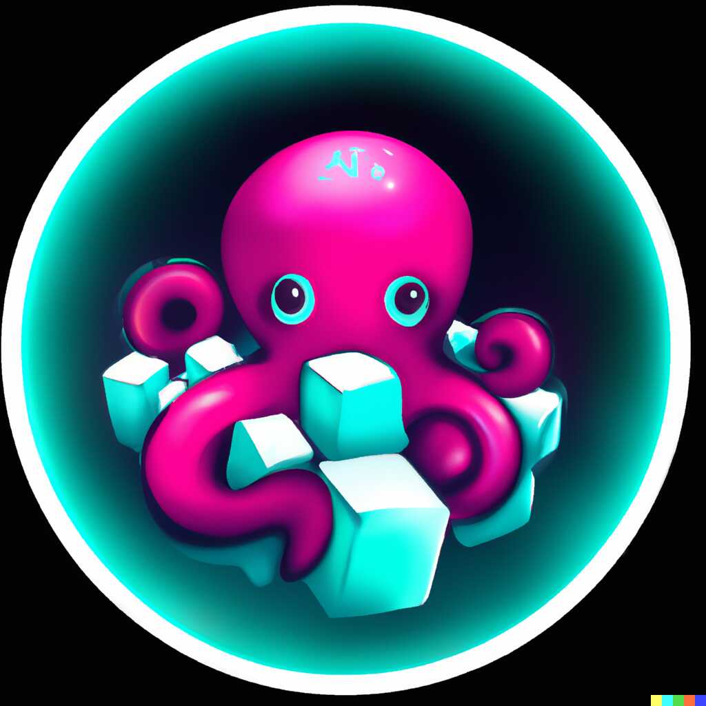
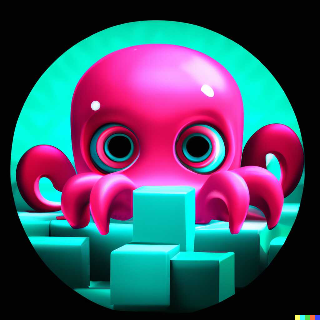

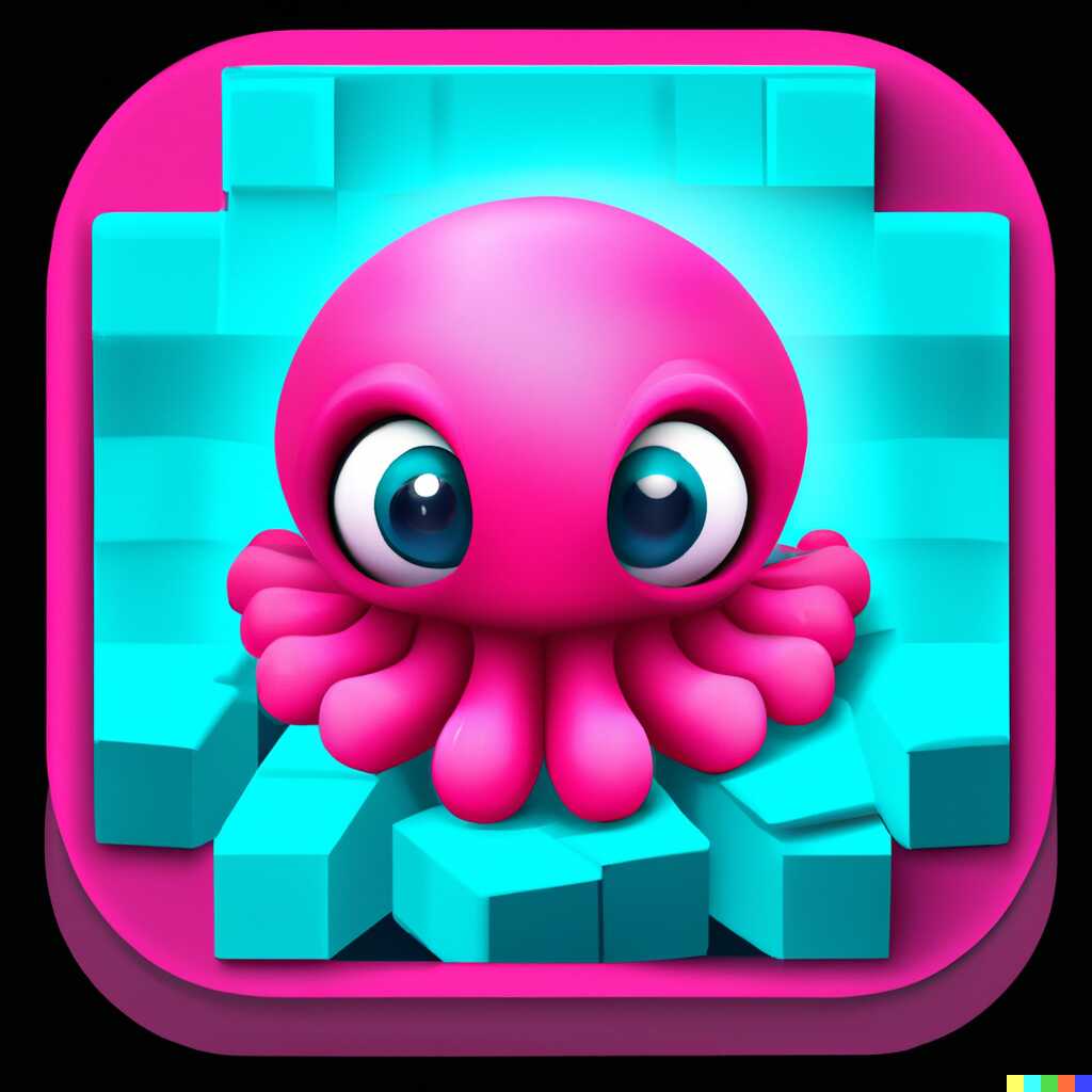

Not really a great direction. Maybe we can edit the original to fit our needs. Right now its very playful. However, OctoSQL is meant for some serious data munching and the logo should reflect that. And really, I can’t think of anything that would inspire more confidence than a yellow safety helmet (obviously; honestly, I can, but a helmet looks good on a logo), so let’s try to add that!
Dragging the transparency brush over the top of its head, and providing the following phrase:
Cute baby octopus playing with cubes wearing a yellow safety helmet, logo, digital art, drawing, in a dark circle as the background, vibrant, cheerful, bubbles
we get some nice results!
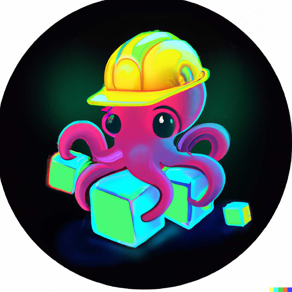
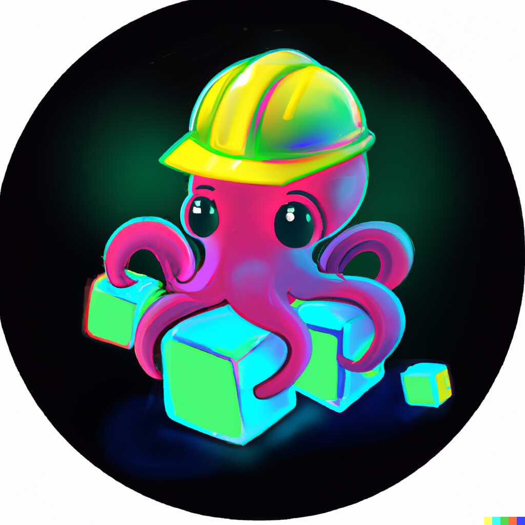
Those are actually really good.
Then I went on a slight detour, trying to generate octopi with helmets right away (and variations based on them). Even though it didn’t lead to anything useful, the cuteness of the resulting octopi is just heartwarming, so I’m leaving them here for you to enjoy. Also, there’s one more plain octopus playing with cubes which I didn’t use but looked very nice.




And then I thought, maybe cubes, data records, databases and blue data storage cylinders just aren’t something that octopi are used to playing with? How about something more natural, like mussels?
Cute baby octopus playing with mussels, logo, digital art, drawing, in a dark circle as the background, vibrant, cheerful, bubbles
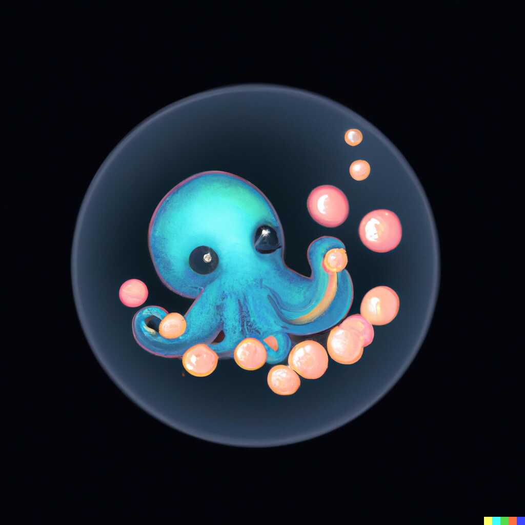
This one really got me. Good size, quite cute, actually mostly correct (not too many artifacts) and the mussels look nice.
So then I edited in a helmet, and then edited a side of the helmet to fix an artifact.
Cute baby octopus playing with mussels wearing a yellow safety helmet, logo, digital art, drawing, in a dark circle as the background, vibrant, cheerful, bubbles


Its left eye is also broken. We can fix that by brushing over it and keeping the same phrase. This way Dall-e will regenerate just the eye.

Fixed! Coming back to those mussels. They look cute, but seen from far away they are just too many, too small. Moreover, it doesn’t really get the original message across. Let’s try to replace them with some “3d shapes” by drawing over the tentacles and adding back “playing with 3d shapes”.
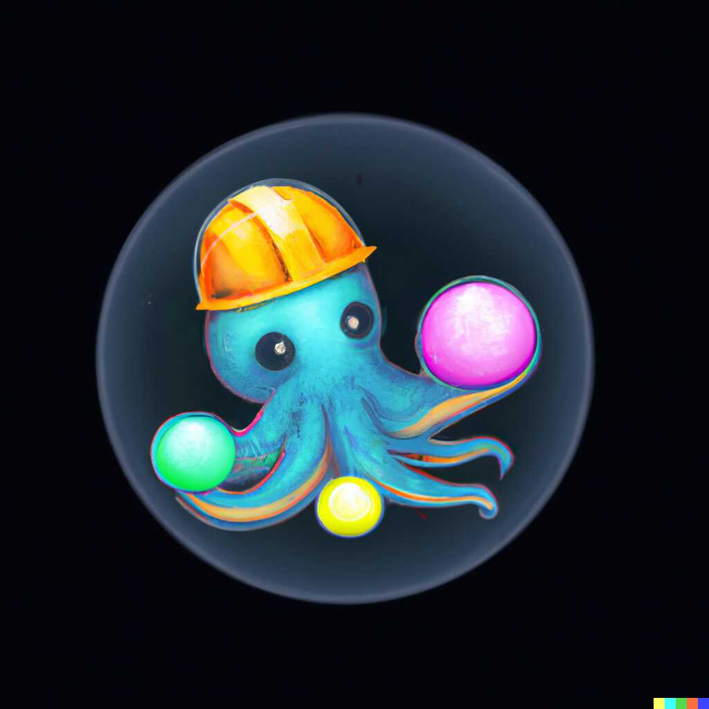

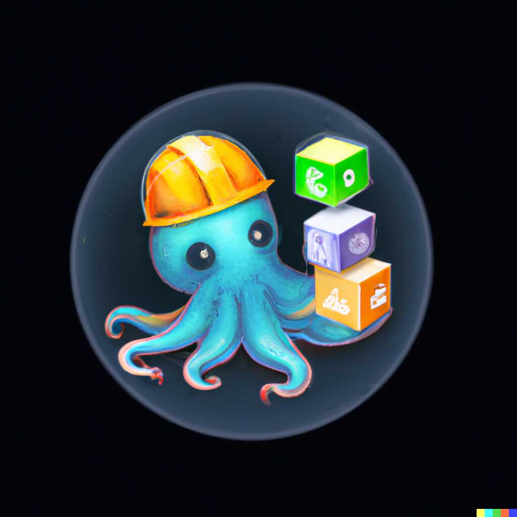
I really liked the first one, but the rightermost sphere is just way too big. And maybe we could add a different shape than a sphere? Anyhow, let’s just paint over it and see if “3d shapes like cubes and spheres” gets us something nice.
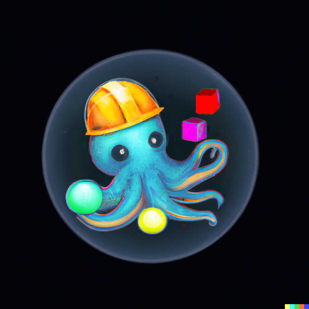
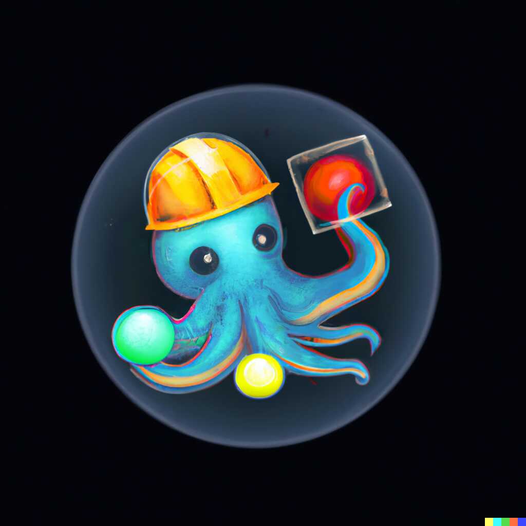
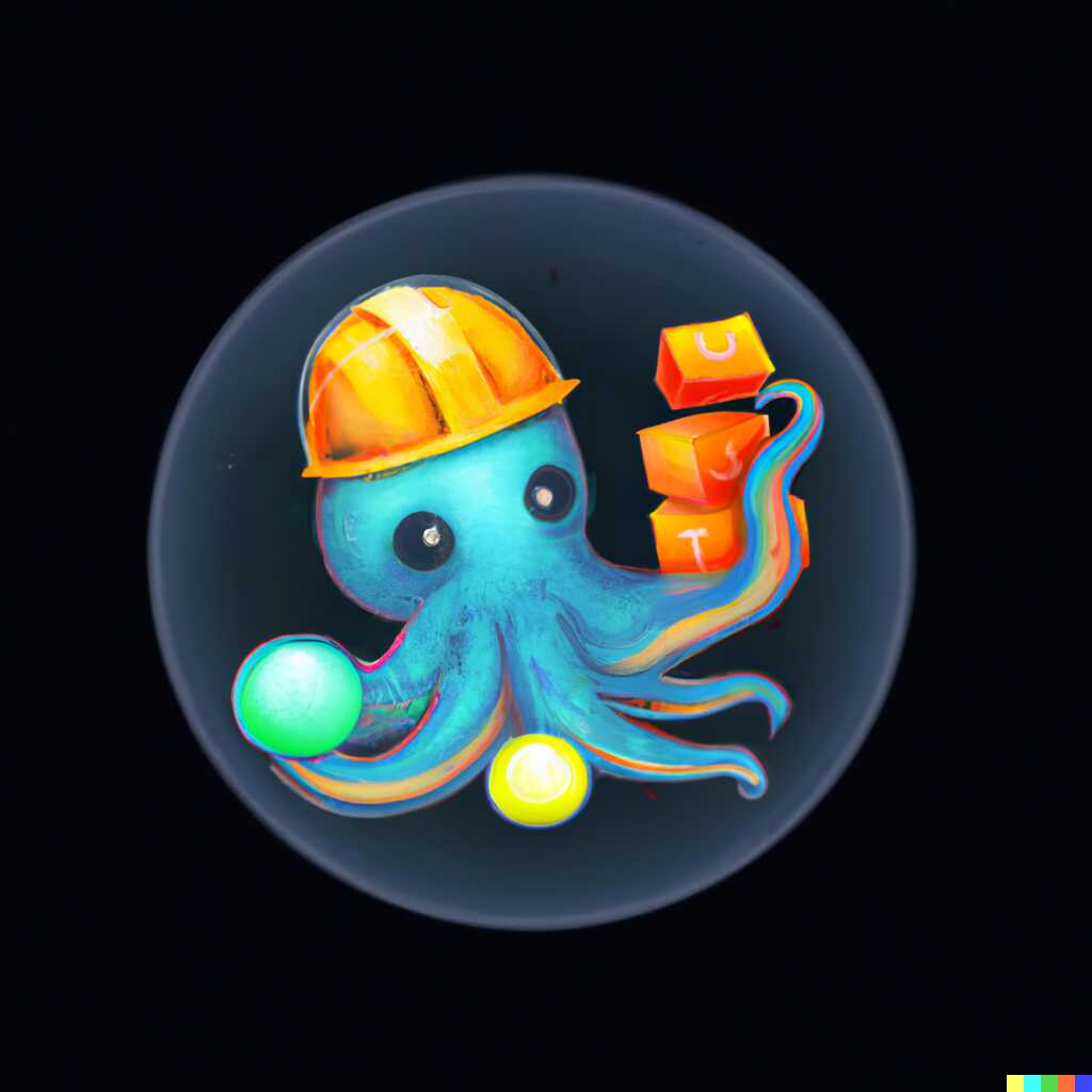
And as you saw in the beginning, the middle one won. That sphere in a cube looks intriguing, the octopus is manipulting a few objects, it’s very logo-shaped, it’s fairly cute, it inspires (some) confidence, and doesn’t have any tiny elements, so looks good at a distance.
Having generated this, I used Procreate to make the background transparent, resize the image to be slightly smaller and make the bubble with the octopus occupy the whole image, leading to this - previously shown - result.

Finally, I did a bunch of Google reverse image searches for it. You know, just to be sure.
To be completely honest, I would prefer something slightly simpler with less complex shapes, but I failed to persuade Dall-e into generating that for me. Moreover, I really am content with this logo.
Conclusion
All in all, it was a fun journey. The end result isn’t ideal, but I’m very happy with it. As far as Dall-e goes, I think right now it’s still very much in a “first iteration” phase for most bits and purposes (the main exception being pencil sketches, those are mind-blowingly good). Artists don’t have anything to worry about for now in my opinion (quite similarly to how it is with Copilot) - stock photo websites on the other hand…
To prove my point regarding pencil sketches, look at this
A mouse teaching other mice data visualization on a whiteboard, digital art, pencil sketch, cute
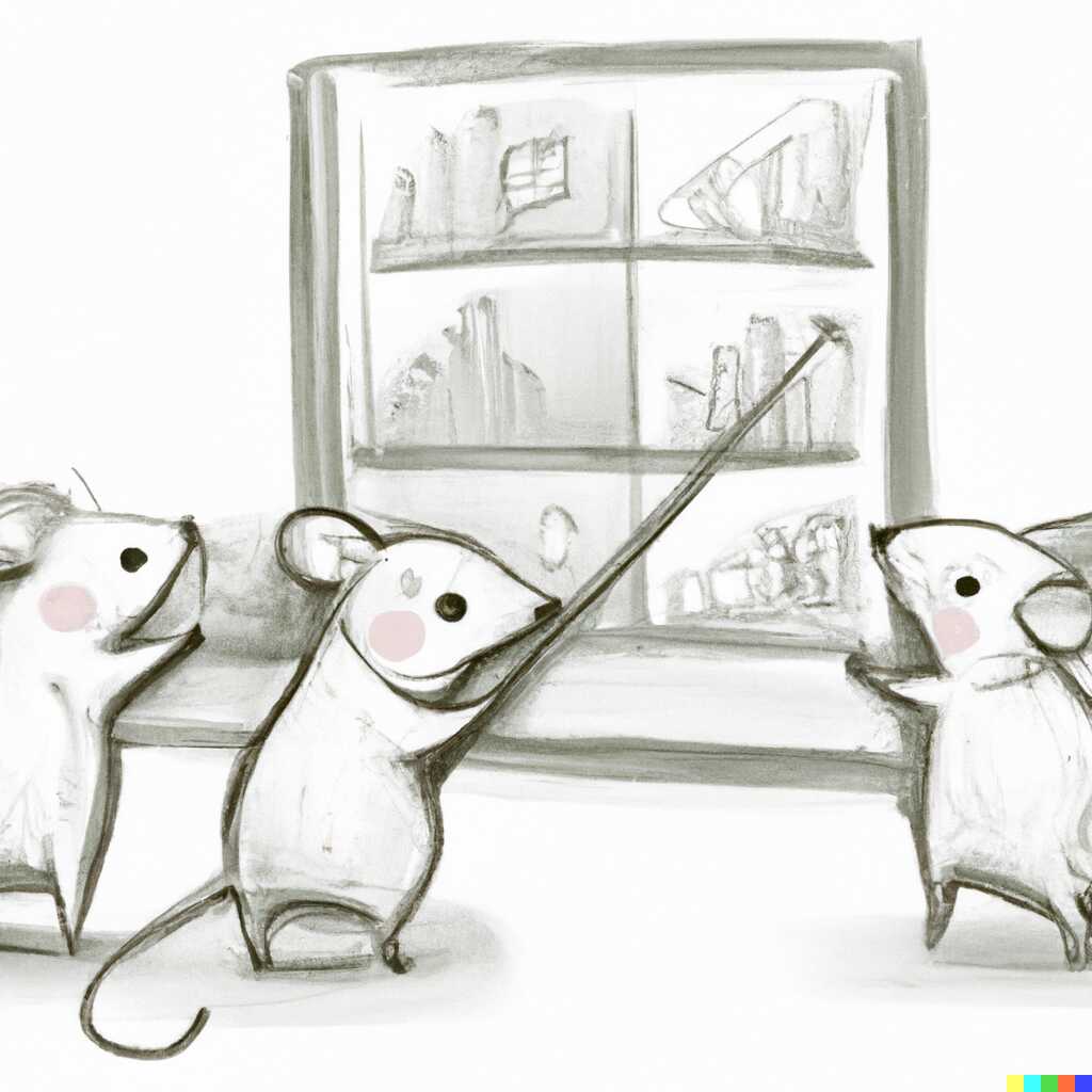
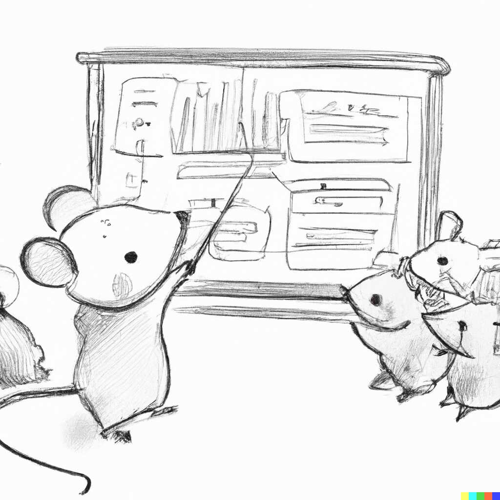
That’s just the ideal kind of content for illustrating presentations, articles or books, and the results have been much more consistent than with other tags.
From a monetary perspective, I’ve spent 30 bucks for the whole thing (in the end I was generating 2-3 edits/variations per minute). In other words, not too much.
Though I think the real breakthrough will come when Dall-e gets 10-100x cheaper (and faster). I would then envision the following process of working with it (which is really just an optimization on top of what I’ve been doing now):
- You write a phrase.
- You are shown a hundred pictures for that phrase, preferably from very different regions of the latent space.
- You select the ones best matching what you want.
- Go back to 2, 4-5 times, getting better results every time.
- Now you can write a phrase for what you would like to change (edit) and the original image would be used as the baseline. Go back to 2 until happy.
Thanks for reading!